For my coursework I have produced music magazine. The magazine contains a front cover, contents page and double page spread. I have followed most of the conventions of magazines by having a cell lines for example to attract the audience into flicking through and buying the magazine. On the other hand, I was told the shadow below the font was rather effective as it challenged the conventions of a magazine as my shadow is around an inch lower than the original text whereas, most shadows are only a couple of millimetres lower, this may attract potential customers as it may stand out to them.
In media many different social groups can be represented, however it is said that many “street” or “ghetto” social group teenagers listen to grime. One way in which the social groups is represented is by the text on the front cover where it says “J2K”, this may show that it is orientated towards the particular group as “mc’s” are known to make tag names up for themselves. Secondly the title “Urban Underground” may show representation on the social groups too as grime music is seen as an underground/niche music genre, in addition to that the word “urban” may also show representation as most “ghetto” or “street” people live in urban areas of cities where there are more estates. Also the main picture may show representation of the groups as he has a hat on hood up, which many “ghetto” teenagers wear nowadays. The age group is also represented as the picture is of a teenager, and it may attract the audience as they may feel they can interact with the magazine.
There are many different ways in which i could distribute magazine. One way is buying approaching an established media institution or I could do it independently. One media institution i could approach is Conde Nast, this would be a good idea as Conde Nast does not currently have a music magazine they produce and distribute.
Another media institution i could approach is Bauer, this would be good as they are not only a successful music magazine but they are also growing rapidly.
Lastly i could do it through an independent distributer as grime may not be seen as a mainstream genre and is relatively small music genre compared to other music genres.
After considering that I would decide to distribute my magazine independently as grime is a rather niche music genre, whereas going through a established distributor would be a bit harder as they may fail to understand the reason for grime music.
The audience for my magazine would be for teenagers mainly between the ages of 13 – 19. One main reason I have chosen the age group of 13 – 19 is because grime is a relatively new music genre, and therefore meaning the old generations most likely would not have heard of grime music for one, and that grime music is distinctively different to other types of music genres, consequently meaning they would not like it.
I attracted my audience by putting a well known grime mc/rapper on the front cover, by doing this i hope that his face will make readers think about looking and even buying the magazine, in addition to that I got the "rapper" on the front cover to have a direct mode of address, making it seem as though he is looking directly at the audience. Also as he is on the front cover it would suggest that there is a double page interview about him, this will attract readers as they may want to find more information out about the mc/rapper. In addition to that i tried to attract the audience by adding an additional glow both inner and outer to the title, this would make it stand out more in the shop.
During the process of this coursework I have used many different technologies in producing different tasks. In producing my preliminary task I used both Adobe Photoshop and Adobe InDesign for photo editing software’s. Even though both had their advantages I found Adobe Photoshop easier to use, this was because it was straight forward and user friendly where as InDesign you would have to do several different steps to do one task. Also Adobe Photoshop was easier for changing files to “jpeg.” From and uploading them as you could save it as normal and change the file type, where as in InDesign you would have to extract it first. I also used Microsoft Excel when analysing my results from my questionnaire, this was useful as it represented the results in several different ways such as bar chats and pie charts.
Looking back at my preliminary task i feel that i have learnt how to make my product more fashionable, but only for the audience’s purpose. By doing this is became more attractable to the audience, this was completed by using fonts, pictures and several different effects.
Monday, 19 April 2010
Thursday, 1 April 2010

Saturday, 20 March 2010
Questionnaire
Questionnaire
Q1. How often do you read magazines?
A) Daily B) Weekly C) Monthly D) Never
A) Daily B) Weekly C) Monthly D) Never
Q2. What type of magazines do you read?
A) Film/TV B) Music C) Gossip D) Other..............
A) Film/TV B) Music C) Gossip D) Other..............
Q3. What would you consider a good price for a monthly released magazine?
A) £0-99p B) £1-£1.99 C) £2-£2.99 D) £3-£3.99 E) £4+
A) £0-99p B) £1-£1.99 C) £2-£2.99 D) £3-£3.99 E) £4+
Q4. What is your favourite music genre?
A) Grime B) Rap C) R’n’B D) Rock E) Other............
A) Grime B) Rap C) R’n’B D) Rock E) Other............
Q5. If a grime magazine was produced, would you be interested in buying it?
A) Yes B) No
A) Yes B) No
Q6. What things would attract you in to purchasing a magazine?
A) Free gifts B) Colours C) Cover Stories D) Cover artist E)Other........
A) Free gifts B) Colours C) Cover Stories D) Cover artist E)Other........
Q7. What music magazines do you currently read, if any?
A) RWD B) NME C) Q D) Mojo E) Other.........
A) RWD B) NME C) Q D) Mojo E) Other.........
Q8. Do you like to listen to new, up and coming artists?
A) Yes B) No
A) Yes B) No
Q9. What would you consider to be a reasonable length for a music magazine?
A) 0-20 Pages B) 20-40 Pages C) 40-60 Pages D) 60+ Pages
A) 0-20 Pages B) 20-40 Pages C) 40-60 Pages D) 60+ Pages
Thank you for taking time to complete this questionnaire.
Tuesday, 16 March 2010

Monday, 15 March 2010
+copy.jpg)
Friday, 12 March 2010
Second draft of front cover
.jpg)
After looking at my first draft I decided to change to person on my front cover. I decided to do that as in this picture there is a more directer mode of address. After receiving feedback I was told that the yellow starp on the bottom of the page does not look too good, as it makes the mag look rather cheap and more like a gossip magazine rather than a music magazine, if i changed the colour of the strap to go with the other colours of the page and look more musical like. On the other hand however, I was told the the shadow below the font was rather effective as it challenged the conventions of a magazine as my shadow is around an inch lower than the original text where as, most shadows are only a couple of milimetres lower, this may attract potential customers as it may stand out to them.
Thursday, 11 March 2010
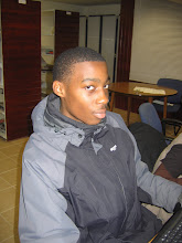
1st Draft of Cover Picture

Friday, 5 March 2010
Double-Page Spread Sketch

To get the sketch on to the computer I had to scan it in, however I had to go over the markings in a black felt tip pen to ensure it was dark enough to see once scanned.
Planning (What I will do and why?)
My aim for this project is to create an appealing grime music magazine. It will be aimed at ages 13 – 19, mainly because grime is a relatively new music genre. In addition to that, it will obviously be aimed at people who like grime, however it is not specifically aimed at a particular gender as music is appealing to both sexes.
The name of my magazine is “Urban Underground”. This is because grime is much seen as an underground music genre and its audience isn’t as big as other music genre’s. The first part of the magazine “Urban” is because it will be aimed at teenagers in urban areas of towns, contain urban issues and problems and also it will have urban fashion.
I plan to do two different photo shoots with the first coming in early March and the other in mid-March; this is because the first photos I take in early march will be used for my front cover. During the time of my first and second photo shoot I will be able to prepare ideas for my second photo shoot as well as working on my front cover. I will have two different artists for my photo shoot, but they will both have an urban look to them. I will try to take my photos in urban areas, so it relates to the magazine title and main audience target. For my second photo shoot I will try to find an area with graffiti, or park as it will look unusual for a grime artist, it will attract people to look at it and buy it.
For my front cover I aim to follow the main conventions of a music magazine by having a title, strap, picture of artist etc.... I have decided to stick to the main conventions of a music magazine because it I challenged them to much it would be hard to identify by potential customers. I will try and use contrasting colours, but I will be using the two neutral colours as well as two others as the fonts, this is because if I use too many colours it will look unprofessional and jumbled up. In addition to that I will use eye-catching words the will catch the audiences eye, I will be putting them in capital letters and bold to ensure that they do catch the potential buyers eye.
For my contents page I will be basing it on an idea that I have already seen. I will take a vertical long-shot of my artist against a white background; this will be the artist on the double page spread, there will be a gap underneath him, this will tell the readers what page his interview is on. To the right of him it will be the main contents where it will be telling the readers where other main articles are within the magazine. If there is space under the contents there may be a short note from the writer as it is the first edition.
My double page spread will have the main conventions of a double page spread. One of the pages will be covered by a picture, however unusually it will have two pull quotes. On the other page I will include a little introduction of the artist, with a interview below it. I will have another main pull quote in the in the middle of the middle column too. The main idea of having the interview is to attract new customers as well attract established fans already.
Thursday, 18 February 2010
Preliminary Task Contents Page

This is the mock up of my contents page. I created this using Adobe Photoshop Elements, due to the fact that I wasnted to see what different effects it had to offer for both text and pictures. Before i uploaded this picture it had to be exported as a jpeg, where as in InDesign you can just save it as a jpeg.
Friday, 5 February 2010
Prelimanary task magazine cover.

This is my preliminary task of my front cover. The main point of this task was to get a feel for the different photo editing software’s available. These two photo editing software’s are "Adobe InDesign" and "Adobe Photoshop Elements". After messing around with the different types of software I found that "Adobe Photoshop Elements" is easier to use on a personal point of view.
After analyzing the mock up of my magazine cover I found that cutting out images is not only long but it does also make the magazine look a bit more unprofessional and less serious. On the other hand though, the slant of the text just above the title, and the change in shape of the title is good as it is different to what you would normally expect to see.
Subscribe to:
Comments (Atom)