My aim for this project is to create an appealing grime music magazine. It will be aimed at ages 13 – 19, mainly because grime is a relatively new music genre. In addition to that, it will obviously be aimed at people who like grime, however it is not specifically aimed at a particular gender as music is appealing to both sexes.
The name of my magazine is “Urban Underground”. This is because grime is much seen as an underground music genre and its audience isn’t as big as other music genre’s. The first part of the magazine “Urban” is because it will be aimed at teenagers in urban areas of towns, contain urban issues and problems and also it will have urban fashion.
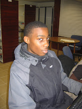
I plan to do two different photo shoots with the first coming in early March and the other in mid-March; this is because the first photos I take in early march will be used for my front cover. During the time of my first and second photo shoot I will be able to prepare ideas for my second photo shoot as well as working on my front cover. I will have two different artists for my photo shoot, but they will both have an urban look to them. I will try to take my photos in urban areas, so it relates to the magazine title and main audience target. For my second photo shoot I will try to find an area with graffiti, or park as it will look unusual for a grime artist, it will attract people to look at it and buy it.
For my front cover I aim to follow the main conventions of a music magazine by having a title, strap, picture of artist etc.... I have decided to stick to the main conventions of a music magazine because it I challenged them to much it would be hard to identify by potential customers. I will try and use contrasting colours, but I will be using the two neutral colours as well as two others as the fonts, this is because if I use too many colours it will look unprofessional and jumbled up. In addition to that I will use eye-catching words the will catch the audiences eye, I will be putting them in capital letters and bold to ensure that they do catch the potential buyers eye.
For my contents page I will be basing it on an idea that I have already seen. I will take a vertical long-shot of my artist against a white background; this will be the artist on the double page spread, there will be a gap underneath him, this will tell the readers what page his interview is on. To the right of him it will be the main contents where it will be telling the readers where other main articles are within the magazine. If there is space under the contents there may be a short note from the writer as it is the first edition.
My double page spread will have the main conventions of a double page spread. One of the pages will be covered by a picture, however unusually it will have two pull quotes. On the other page I will include a little introduction of the artist, with a interview below it. I will have another main pull quote in the in the middle of the middle column too. The main idea of having the interview is to attract new customers as well attract established fans already.
Subscribe to:
Post Comments (Atom)

No comments:
Post a Comment