For my coursework I have produced music magazine. The magazine contains a front cover, contents page and double page spread. I have followed most of the conventions of magazines by having a cell lines for example to attract the audience into flicking through and buying the magazine. On the other hand, I was told the shadow below the font was rather effective as it challenged the conventions of a magazine as my shadow is around an inch lower than the original text whereas, most shadows are only a couple of millimetres lower, this may attract potential customers as it may stand out to them.
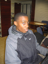
In media many different social groups can be represented, however it is said that many “street” or “ghetto” social group teenagers listen to grime. One way in which the social groups is represented is by the text on the front cover where it says “J2K”, this may show that it is orientated towards the particular group as “mc’s” are known to make tag names up for themselves. Secondly the title “Urban Underground” may show representation on the social groups too as grime music is seen as an underground/niche music genre, in addition to that the word “urban” may also show representation as most “ghetto” or “street” people live in urban areas of cities where there are more estates. Also the main picture may show representation of the groups as he has a hat on hood up, which many “ghetto” teenagers wear nowadays. The age group is also represented as the picture is of a teenager, and it may attract the audience as they may feel they can interact with the magazine.
There are many different ways in which i could distribute magazine. One way is buying approaching an established media institution or I could do it independently. One media institution i could approach is Conde Nast, this would be a good idea as Conde Nast does not currently have a music magazine they produce and distribute.
Another media institution i could approach is Bauer, this would be good as they are not only a successful music magazine but they are also growing rapidly.
Lastly i could do it through an independent distributer as grime may not be seen as a mainstream genre and is relatively small music genre compared to other music genres.
After considering that I would decide to distribute my magazine independently as grime is a rather niche music genre, whereas going through a established distributor would be a bit harder as they may fail to understand the reason for grime music.
The audience for my magazine would be for teenagers mainly between the ages of 13 – 19. One main reason I have chosen the age group of 13 – 19 is because grime is a relatively new music genre, and therefore meaning the old generations most likely would not have heard of grime music for one, and that grime music is distinctively different to other types of music genres, consequently meaning they would not like it.
I attracted my audience by putting a well known grime mc/rapper on the front cover, by doing this i hope that his face will make readers think about looking and even buying the magazine, in addition to that I got the "rapper" on the front cover to have a direct mode of address, making it seem as though he is looking directly at the audience. Also as he is on the front cover it would suggest that there is a double page interview about him, this will attract readers as they may want to find more information out about the mc/rapper. In addition to that i tried to attract the audience by adding an additional glow both inner and outer to the title, this would make it stand out more in the shop.
During the process of this coursework I have used many different technologies in producing different tasks. In producing my preliminary task I used both Adobe Photoshop and Adobe InDesign for photo editing software’s. Even though both had their advantages I found Adobe Photoshop easier to use, this was because it was straight forward and user friendly where as InDesign you would have to do several different steps to do one task. Also Adobe Photoshop was easier for changing files to “jpeg.” From and uploading them as you could save it as normal and change the file type, where as in InDesign you would have to extract it first. I also used Microsoft Excel when analysing my results from my questionnaire, this was useful as it represented the results in several different ways such as bar chats and pie charts.
Looking back at my preliminary task i feel that i have learnt how to make my product more fashionable, but only for the audience’s purpose. By doing this is became more attractable to the audience, this was completed by using fonts, pictures and several different effects.
Subscribe to:
Post Comments (Atom)

Your evaluation seems sensible but there is still no DPS here and this version of the front cover is not finished. You have 24 hours to correct this.
ReplyDelete